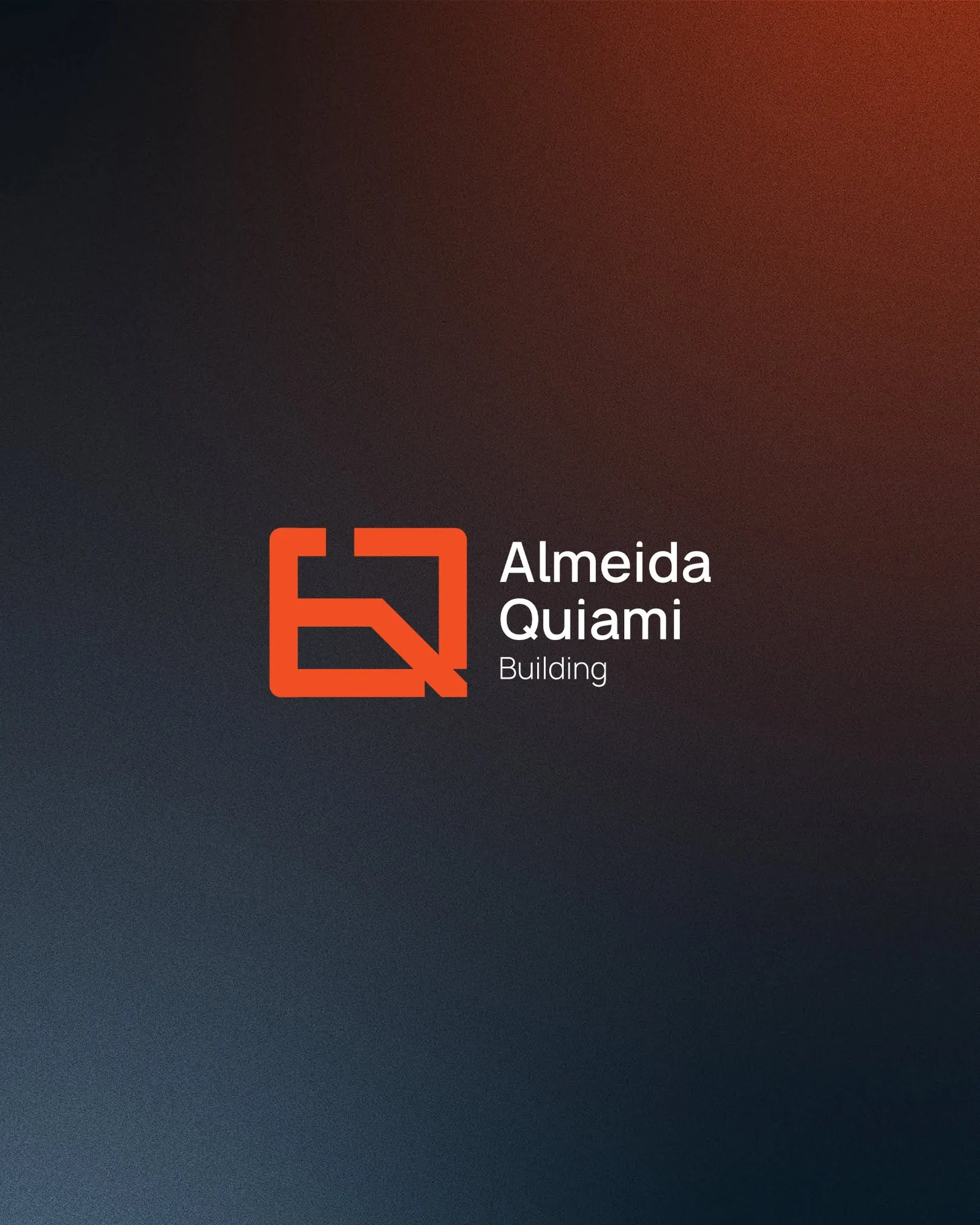
Almeida Quiami Building
A civil construction company in Luanda that wins large public works — given an a + Q monogram drawn like a floor plan, a palette of site orange and engineer navy, and a system that signs everything from a chest pocket to a full construction hoarding.
Almeida Quiami Building manages and executes obras de grande porte — large-scale works: schools, offices, public buildings. Its clients are ministries, investors and developers who decide with their eyes long before they read a tender document. Yet like most construction firms, the company’s name lived only in paperwork — while its competitors’ cranes carried logos across the skyline.
The brief was to give the builder a mark of its own: one that holds up in the places construction brands actually live — embroidered on a work shirt, laminated on an ID badge, and printed forty metres wide on the hoarding around a live site, covered in dust and read from a moving car.
The brief, in one sentence: build a mark that signs a business card and a building site with the same authority.
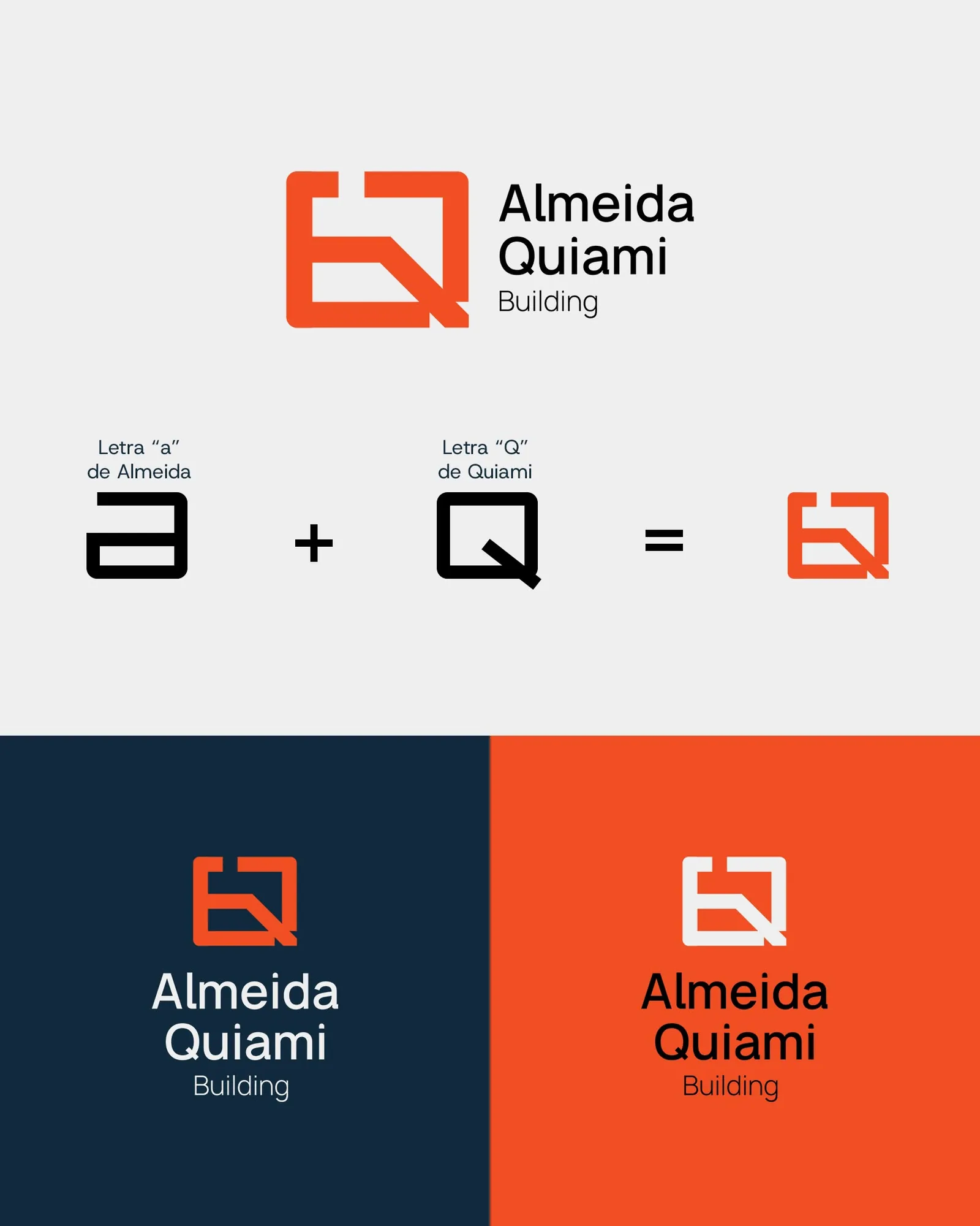
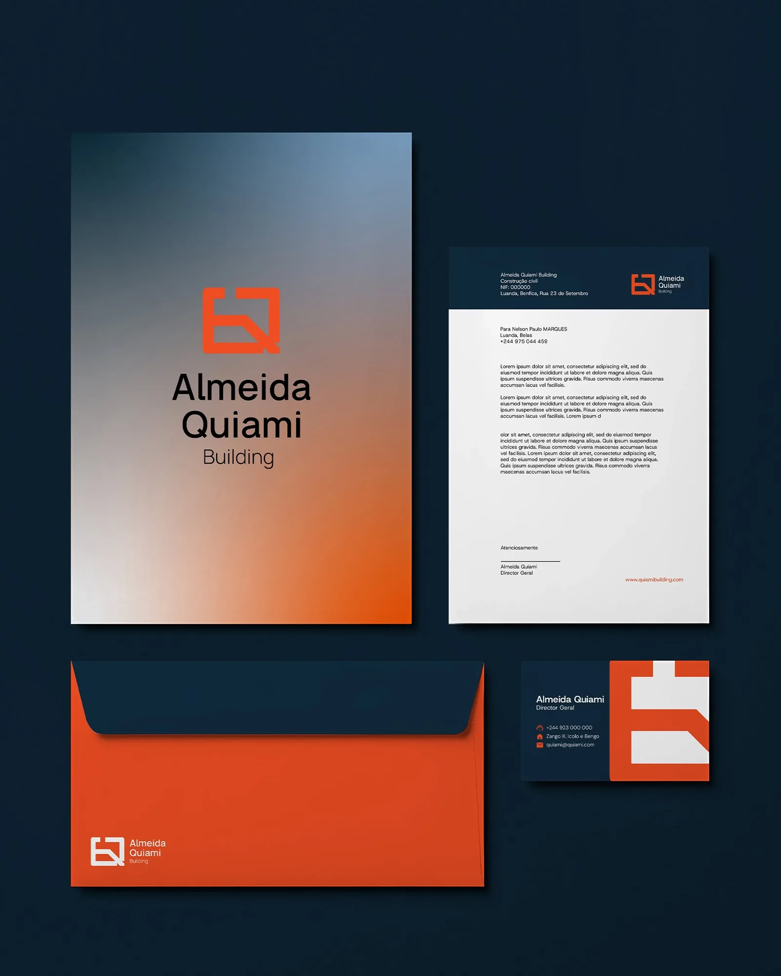
We built the identity on a single idea: a monogram drawn like a floor plan. The lowercase a of Almeida and the capital Q of Quiami merge into one square badge — a single continuous stroke with square corners and one diagonal cut, the Q’s tail leaving the frame like an access ramp on a site drawing. It reads as two letters, and it reads as the outline of a foundation.
The palette does the rest of the talking: high-visibility site orange against deep engineer navy — the colours of safety vests and blueprints — with an off-white ground for print. The wordmark is a plain geometric sans, set flush and calm: the mark makes the noise; the name signs it.
The construction is honest enough to publish: a squared lowercase a plus a squared capital Q, overlapped until they share one stroke. Because the mark is a single weight with no fine detail, it survives everything a building site throws at it — embroidery, laser-cut steel, vinyl on mesh, even a crop: cut the badge in half on the edge of a hoarding and the diagonal tail still says Q. Every colourway — orange on navy, white on orange, navy on white — was tested before a single mockup was made.
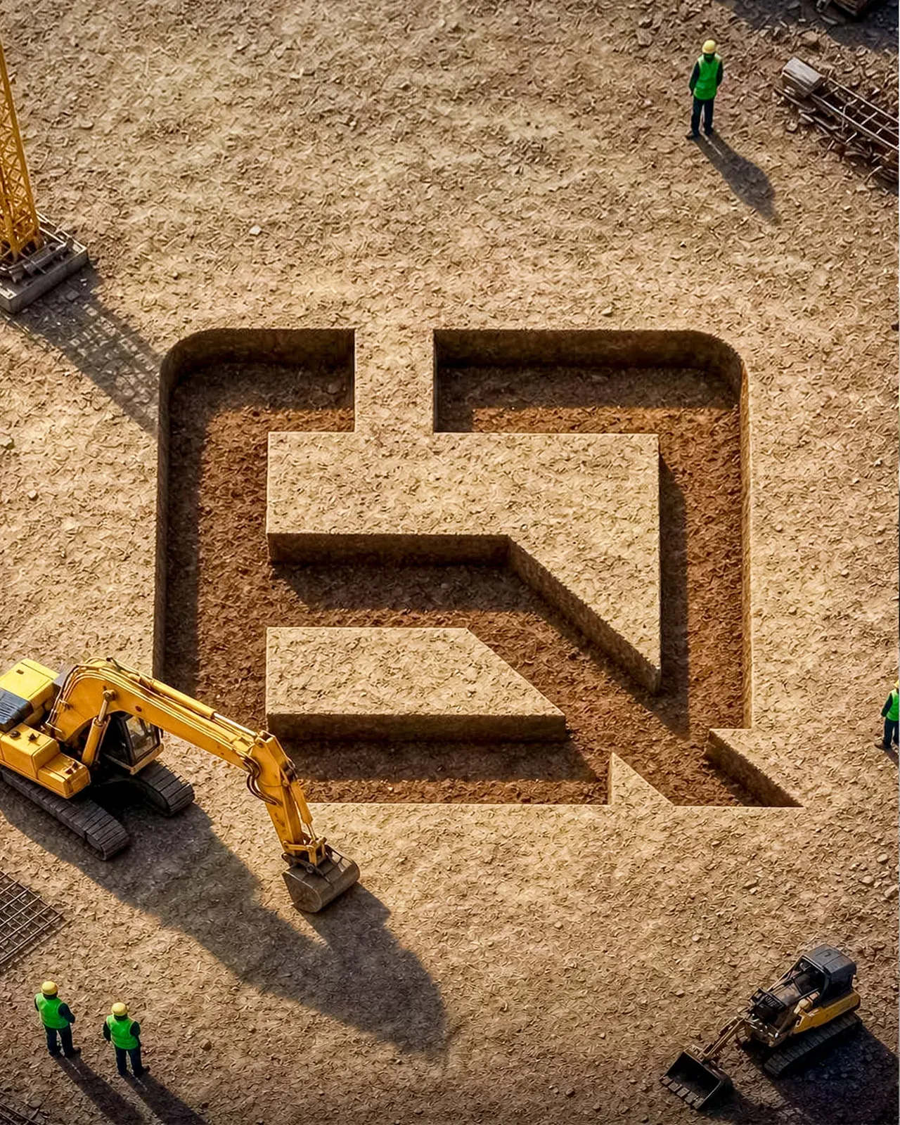
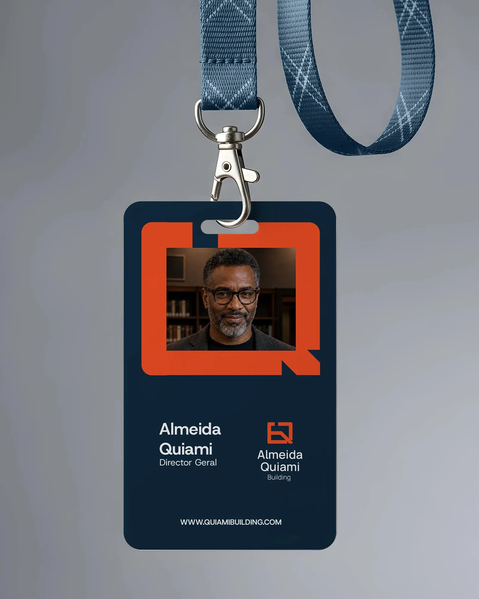
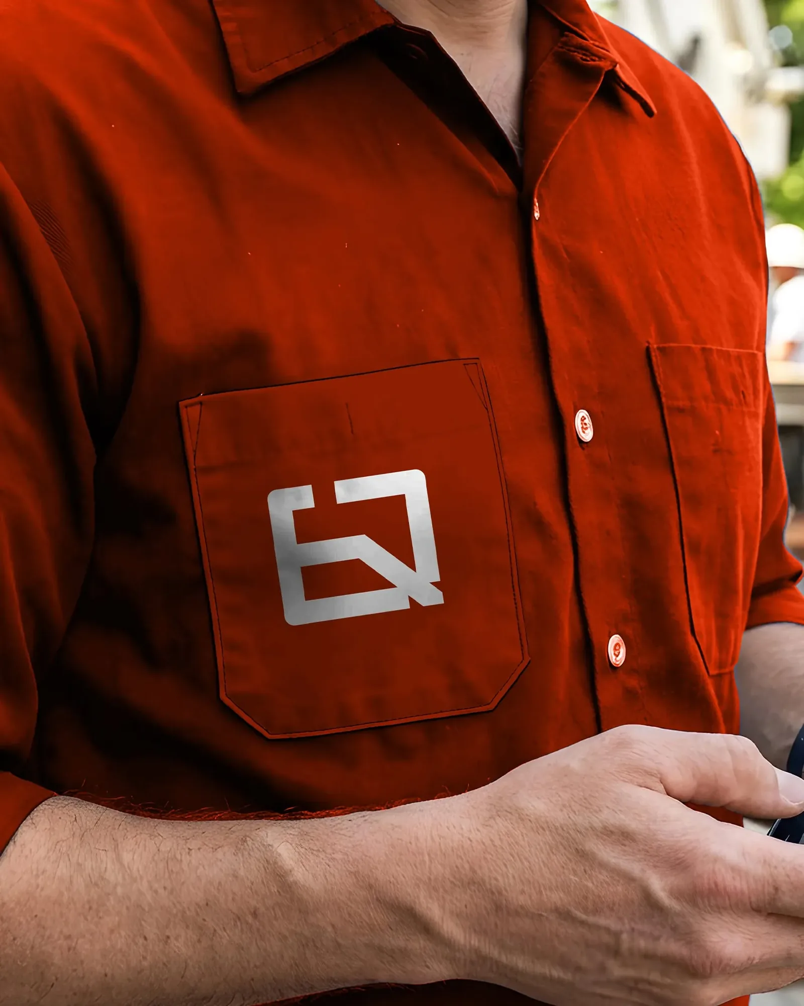
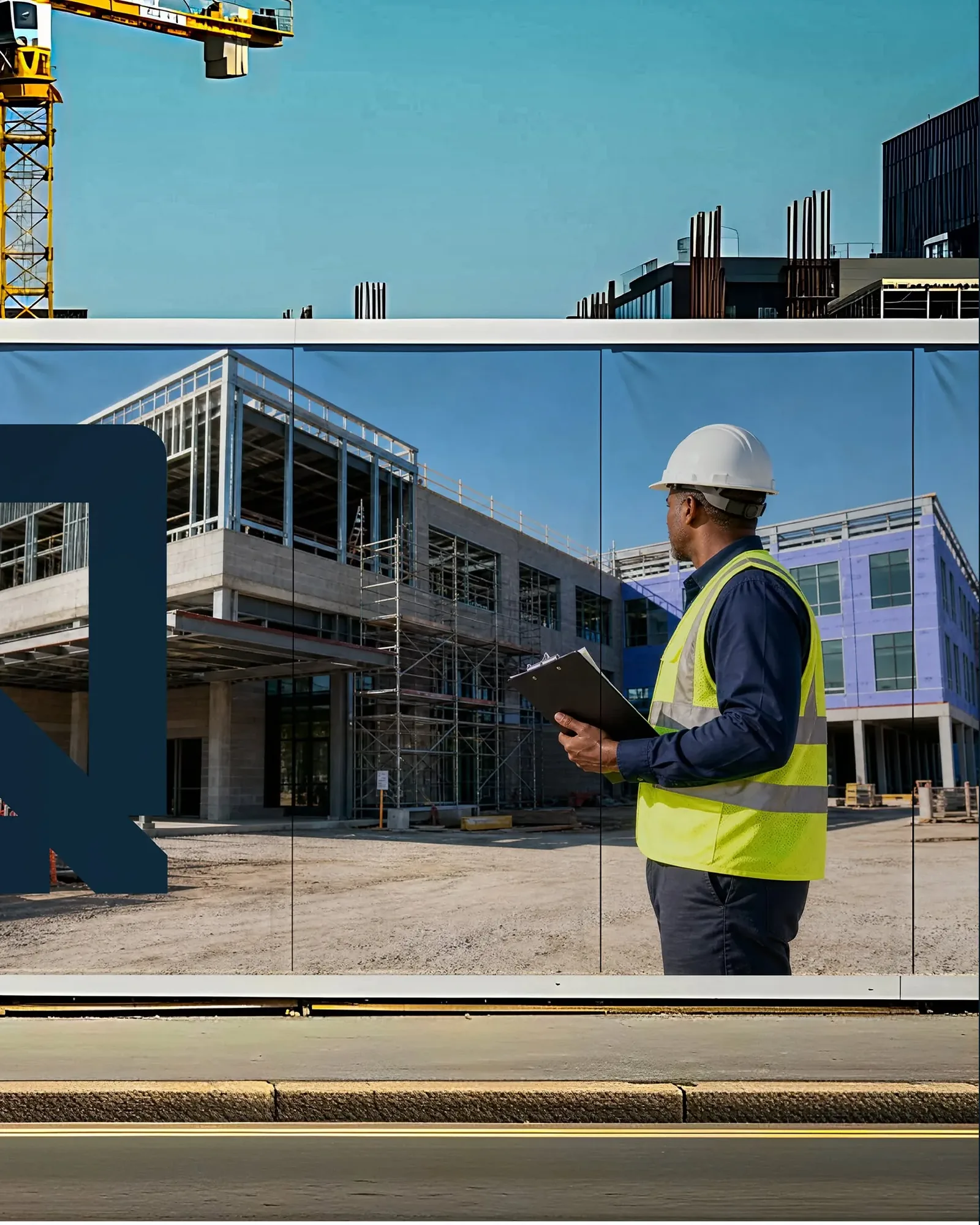
Then the identity walked onto the site. The hoarding system turns every fence into media: orange panels announce the project in plain language, while the monogram — blown up past the edge of the panel — turns the construction itself into the campaign photo.

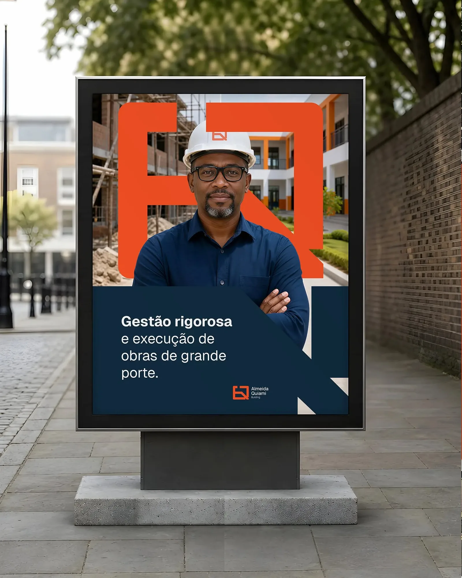
The day the first hoarding went up, the site started introducing us before we said a word.
Building a company that builds?
Start a project →A name in the paperwork.
A construction group known to registries and contracts — with no mark of its own on the very buildings it raised.
After — a mark on the skyline