Shadow Cosmetics
A cosmetics label launching into the most crowded shelf in retail — given a name it could own, a wordmark that plays with light, and a charter that keeps every application sharp.
Shadow arrived with a strong product line, a registered name and nothing to put on the box. In beauty, the shelf decides in under three seconds — and “Shadow” is a word that could read gothic, cheap, or luxurious depending entirely on how it’s drawn.
The founder’s fear was specific: “I don’t want a logo that looks like everyone else’s serif. I want people to recognize us with the label half-turned.”
The brief, in one sentence: make “Shadow” read as light, not darkness — an identity built on contrast, not gloom.
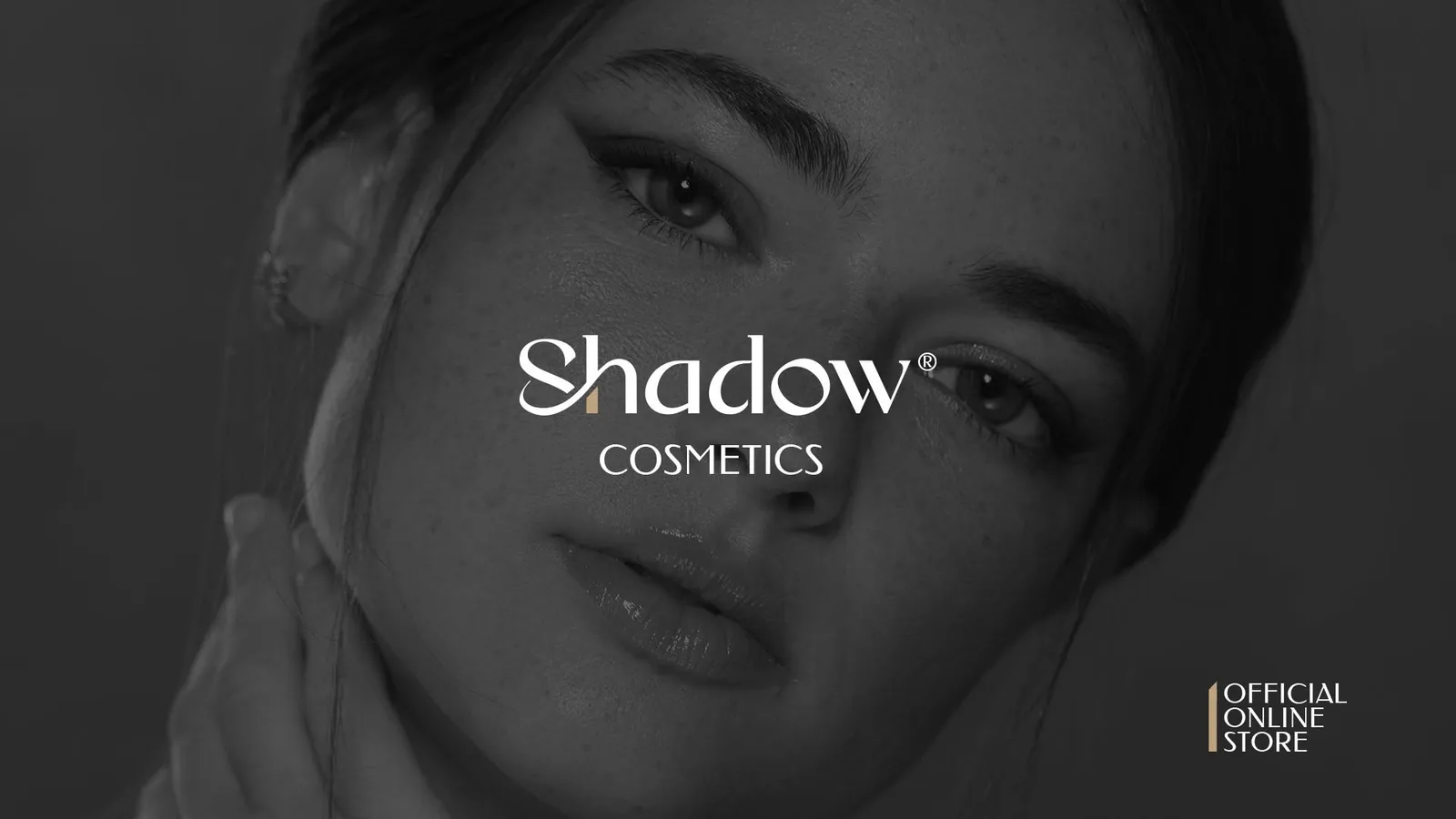
Every shadow needs a light source. That became the whole idea: a near-black world with one deliberate glint of gold. Instead of decorating the wordmark, we drew a high-contrast serif logotype where a single letter carries a champagne-gold cut — the light that makes the shadow exist.
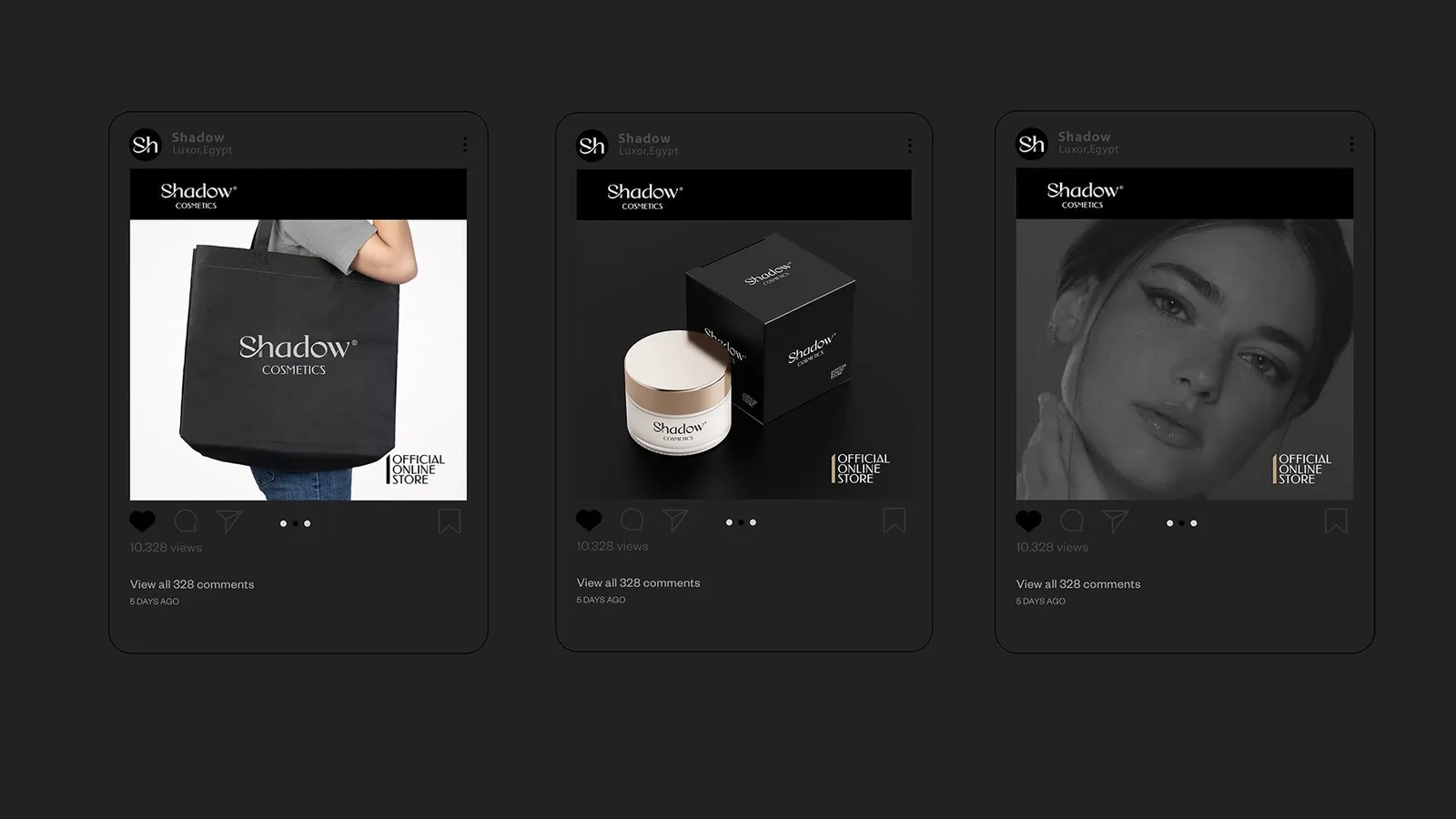
The positioning followed the same logic: Shadow doesn’t compete on brightness like mass cosmetics, it competes on depth. Noir packaging, generous negative space, and one metallic gesture per surface — never more.
Three logotype directions went to testing: a geometric sans (confident, forgettable), a flourished script (beautiful, illegible at 12 mm), and a high-contrast serif with calligraphic terminals. The serif won on the only test that matters for packaging — recognition at small sizes, embossed, foiled, and half-turned on a shelf. Every glyph was then redrawn as vectors and the full logotype converted to outlines, so it renders identically from a lipstick barrel to a storefront.
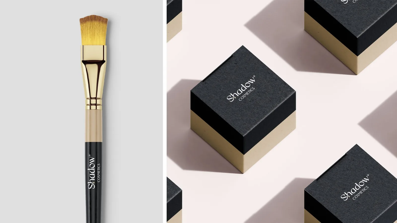
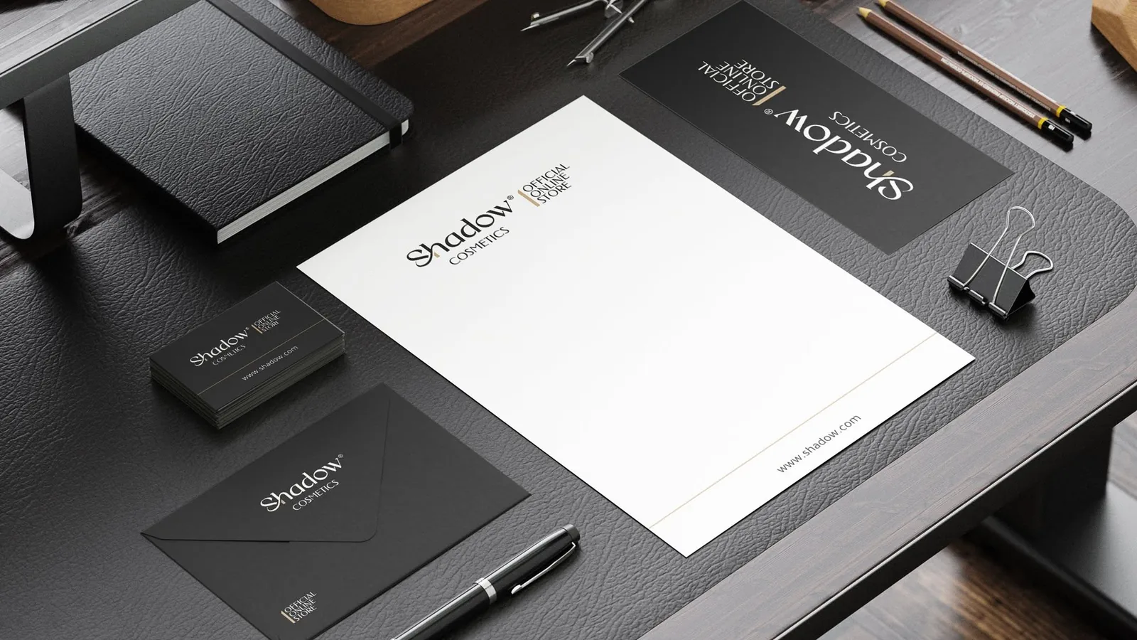
The ® finally feels earned. It looks like a house that’s been here for decades.
Launching a brand of your own?
Start a project →A registered name.
A brand that existed on paper only — a name with no face, no voice, and nothing for a customer to hold on to.
After — a signature