Techcit
A technology company that sounded like everyone and looked like no one — given a monogram engineered on a grid, one volt-green accent, and a system that stays sharp from a 16-pixel app icon to a metro billboard.
Techcit had the classic tech-company problem: a generic blue logo, a name ending in “-it” like a thousand competitors, and no visual asset anyone could remember. Their audience lives on screens — which means the brand’s smallest, most frequent stage is an app icon, not a letterhead.
The brief was blunt: “When our icon sits next to Discord and YouTube on a home screen, it has to hold its own.”
The brief, in one sentence: make Techcit unmistakable at 16 pixels — and let everything larger inherit that clarity.
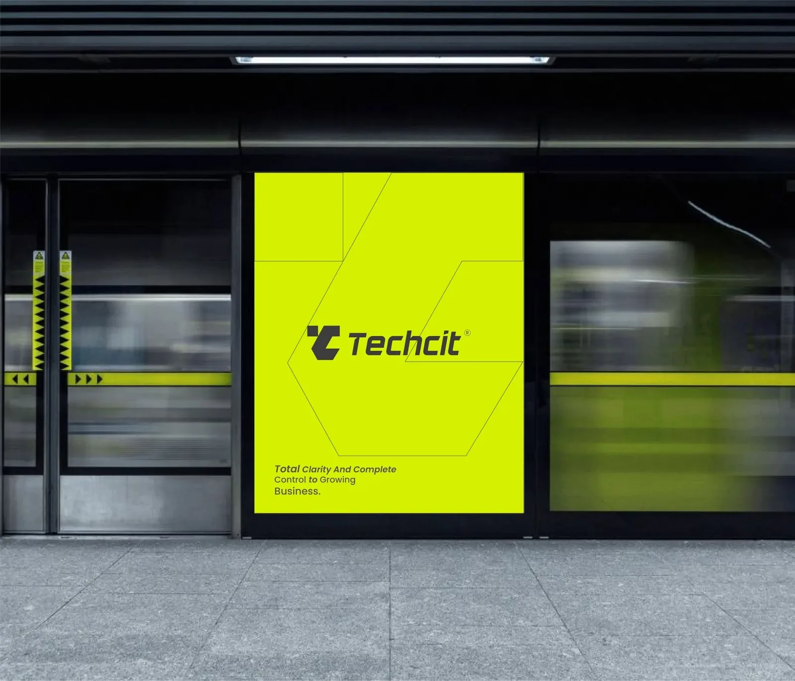
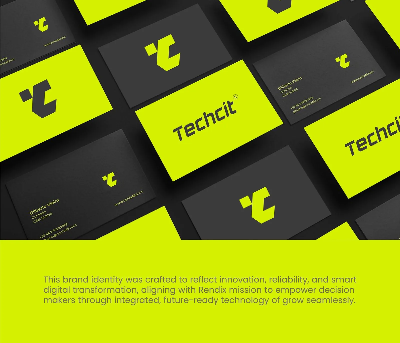
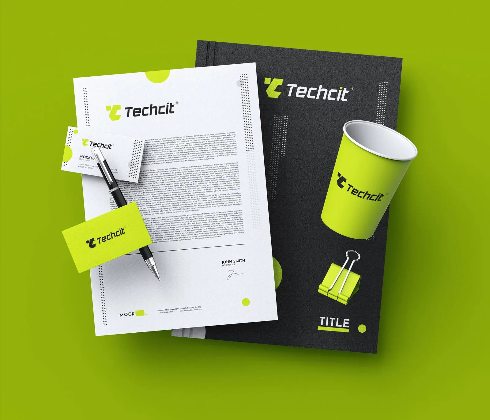
Most tech brands whisper in gradients of blue. Techcit would speak in one voltage: electric volt green on near-black. Two colors, no decoration — the restraint is the luxury. We fused the T and C into a single angular monogram that reads as a forward gesture, then paired it with a fast italic wordmark that carries the same cut angles.
The positioning followed: Techcit doesn’t sell software, it sells momentum — trust, innovation and reliability compressed into one mark that looks like it’s already moving.
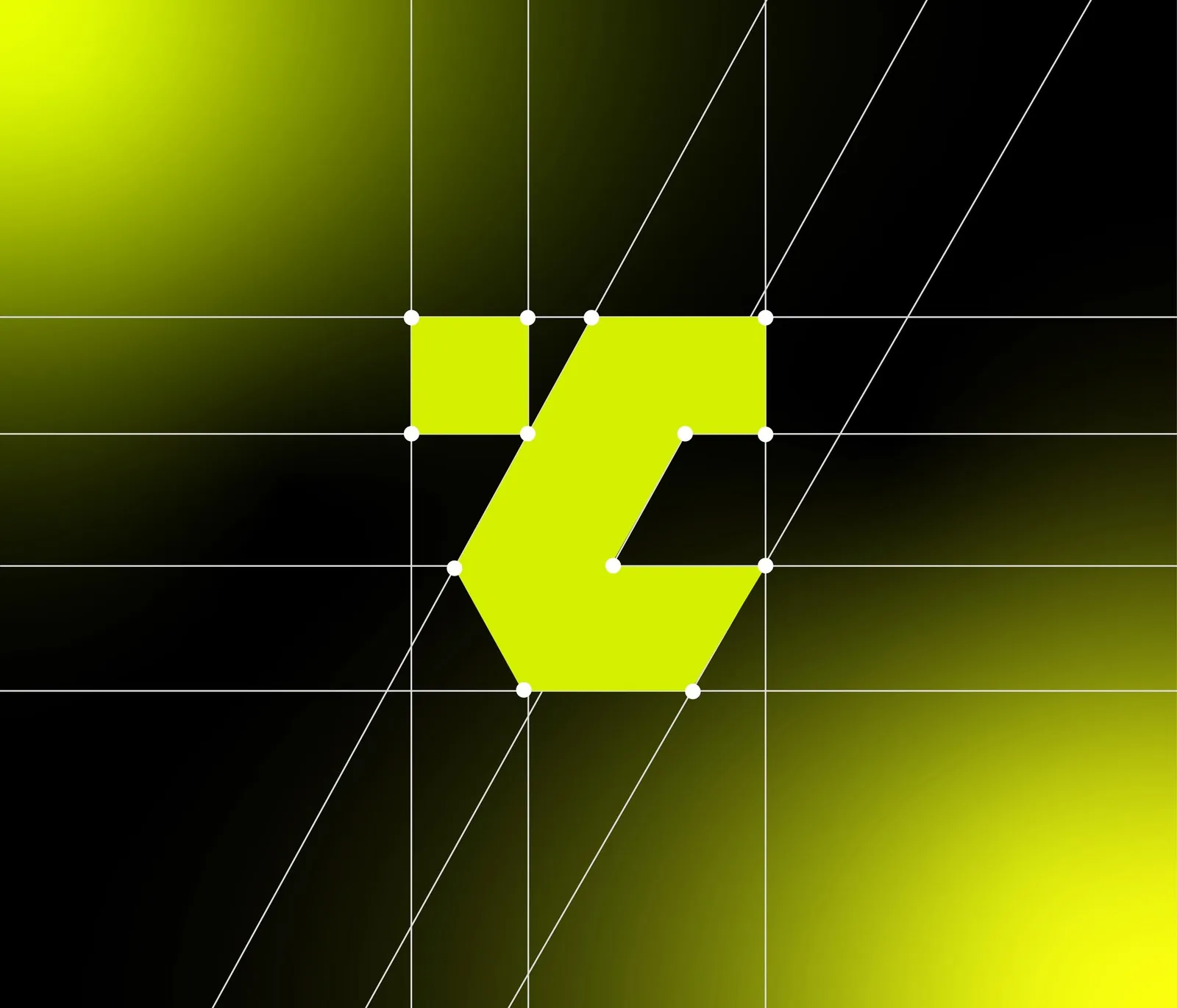
The monogram wasn’t drawn — it was engineered. Every angle of the TC ligature sits on a shared construction grid: the same diagonals govern the mark, the wordmark’s italic slant, and the hexagonal frame used across applications. That discipline is what lets the mark survive its hardest test — rendered at app-icon size, inverted, embossed, or animated — without losing a degree of its geometry.
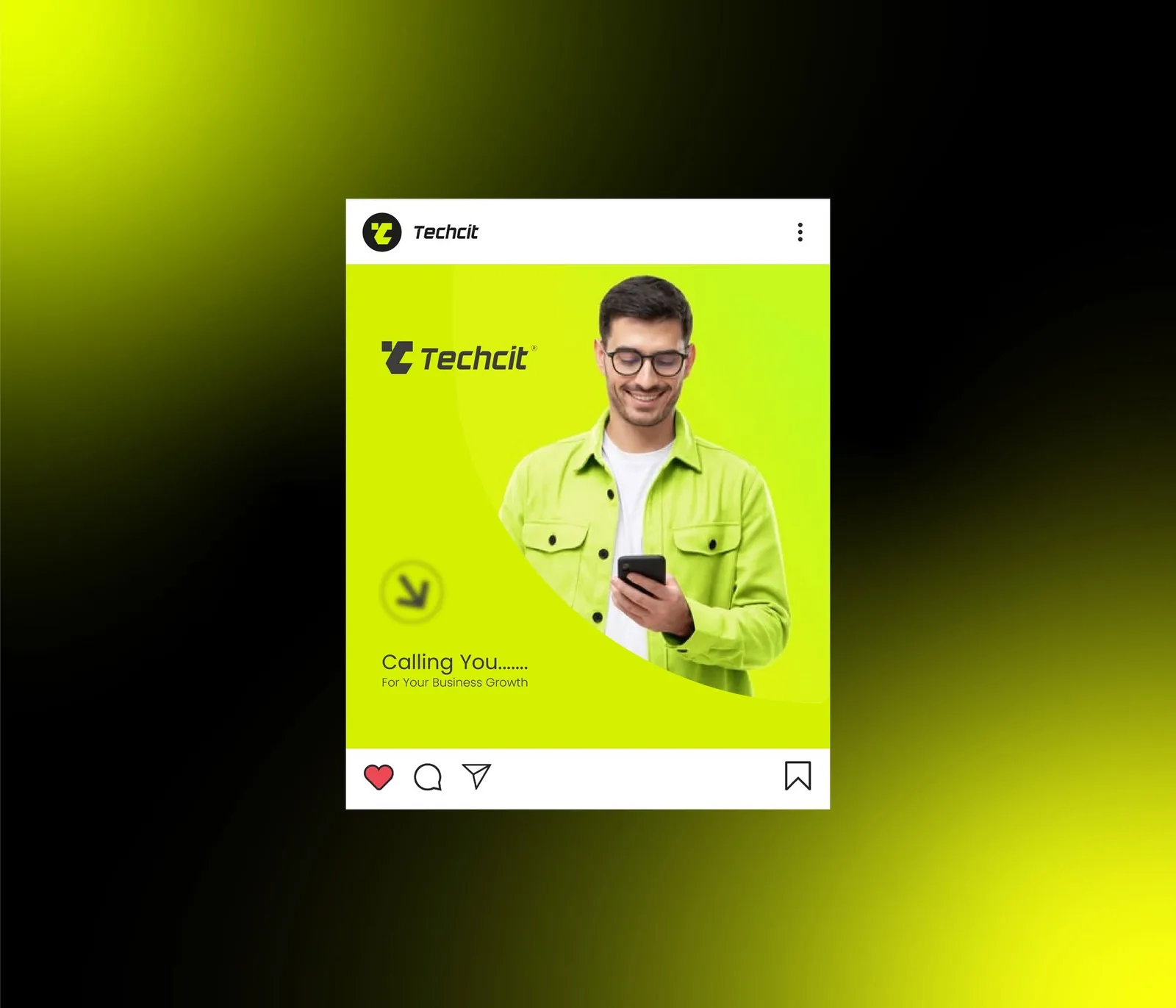
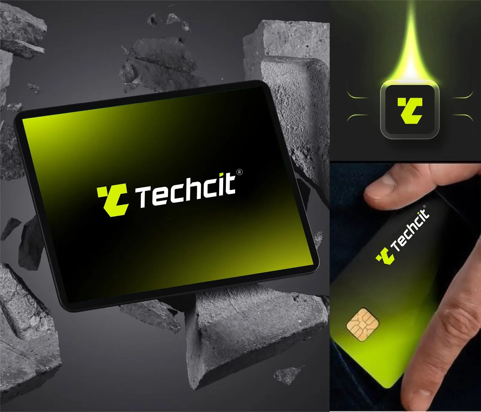
Our icon finally looks like it belongs on the first home screen — not in a folder.
Rebranding a tech company of your own?
Start a project →Generic tech blue.
The default costume of the category — safe blue, safe geometry, indistinguishable from every other IT services deck.
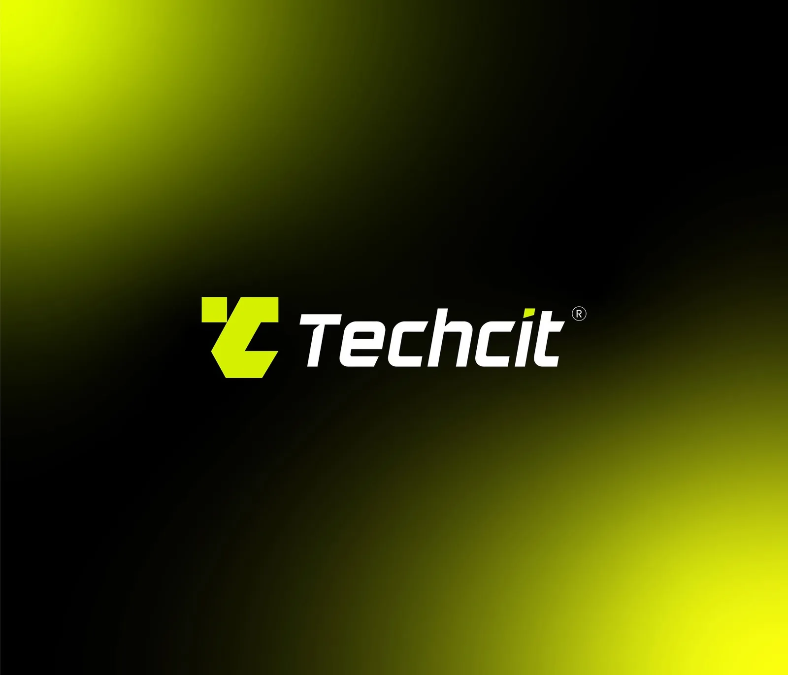 After — one voltage