contact@theystudiodesign.com Casablanca · — GMT+1
Case study — 06

Priscy Skin Care

A skincare line that needed to feel like a ritual, not a routine — given a four-petal star drawn from pure circles, a serif wordmark with one hand-drawn ligature, and a forest-green world that carries from tube to tote bag.

Client
Priscy Skin Care
Sector
Beauty / Skincare
Year
2026
Services
Brand identity · Logotype · Packaging
Timeline
6 weeks
01 — The challenge

The skincare shelf is a wall of sameness: white tubes, thin sans-serifs, a leaf where a personality should be. Priscy was launching into that wall with a real formula story — lactic acid, Barbados cherry extract — and no visual language to tell it.

The brand needed warmth without softness and science without coldness: an identity that could sit in a spa, on a pharmacy shelf, and in an Instagram feed without changing its voice.

The brief, in one sentence: make skincare feel like a ritual — precise underneath, sensual on the surface.

02 — The strategy

We built the identity on a single idea: the glow between. Four circles overlap and the space they leave behind becomes a star — the negative space is the mark, the way skincare works in the space between skin and light. Around it, a deep forest-green palette warmed by terracotta and cream, closer to an apothecary than a laboratory.

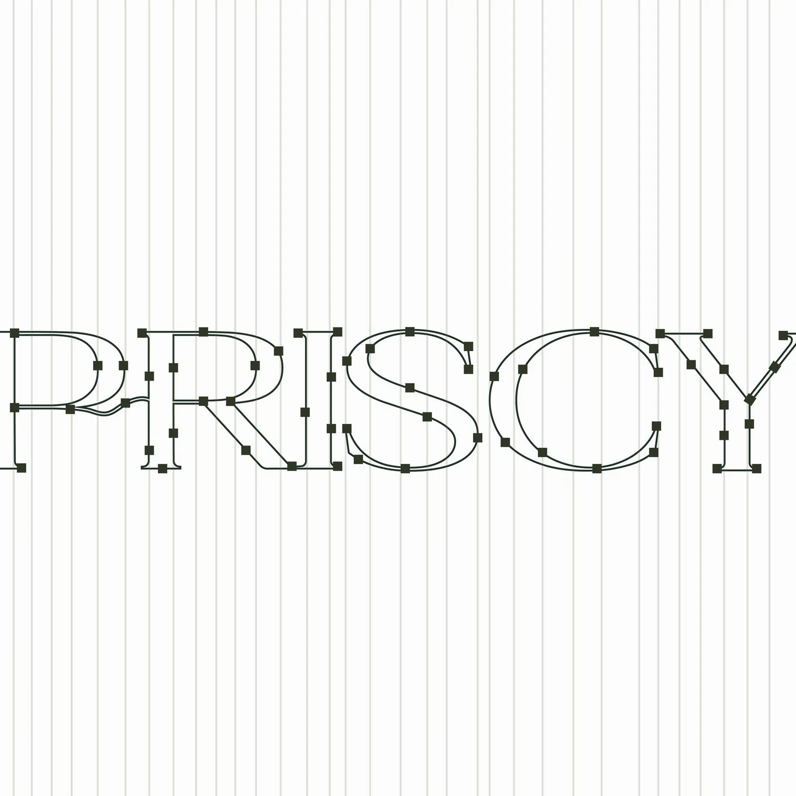
The wordmark answers in kind: a high-contrast serif with one hand-drawn ligature flowing from the P into the R — the human gesture inside the geometric system.
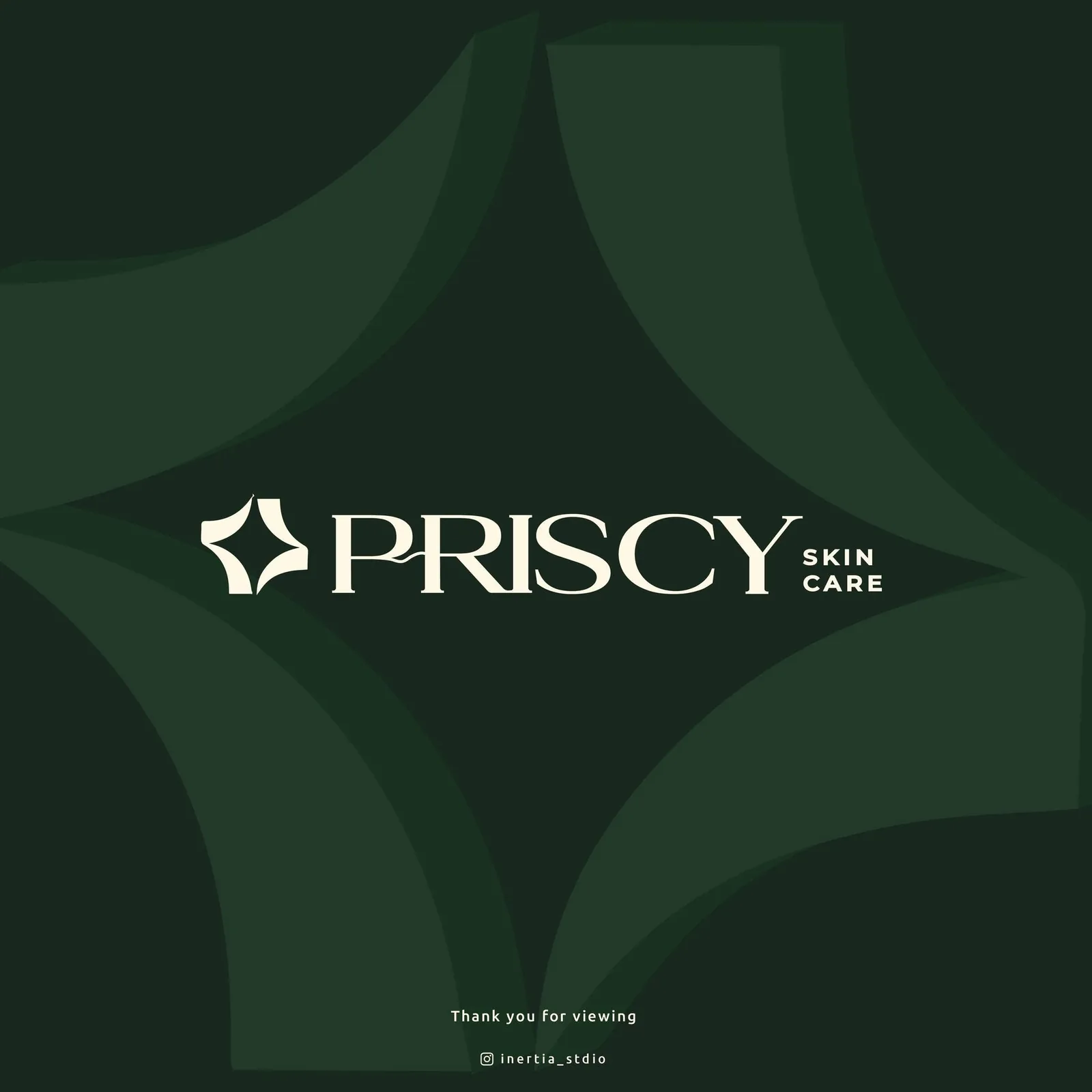
Priscy Skin Care primary lockup — cream star mark and serif wordmark on deep forest green
Fig. 01 — The primary lockup: the star mark and serif wordmark in cream on forest green.
03 — The process

Nothing in the mark is freehand. The star is constructed from eight intersecting circles — every curve of every petal is an arc of one of them — and the wordmark’s serifs, joins and that P-to-R ligature were drawn point by point on the same drafting logic. Discipline in construction is what lets the mark relax in use: printed at 8 mm on a tube cap or blown up across a campaign portrait, it never wobbles.
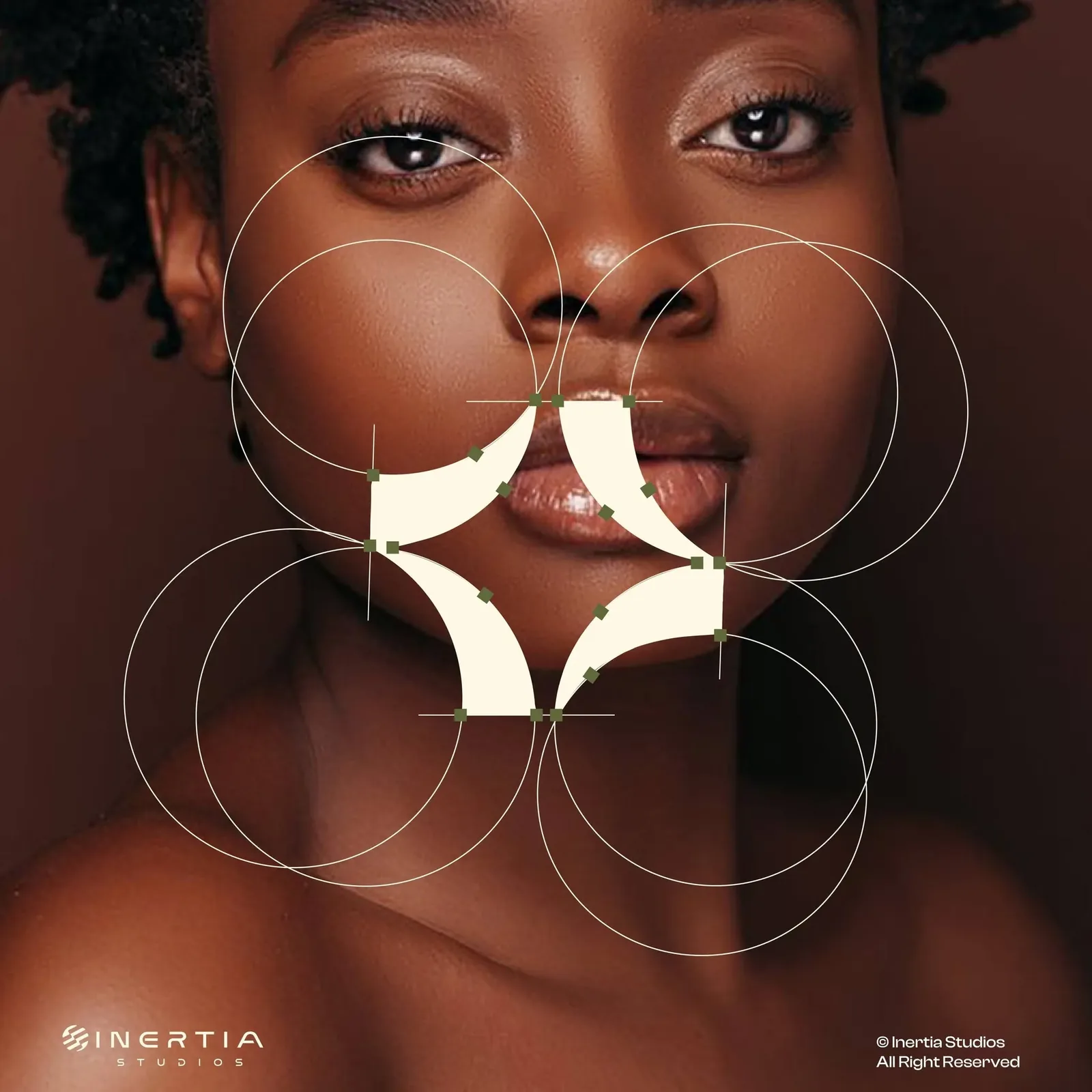
Priscy star mark construction — overlapping circles and anchor points drawn over a campaign portrait
Fig. 02 — The star mark: four petals born from eight circles.
Priscy wordmark construction — Bézier outlines and anchor points of the serif letterforms on a vertical grid
Fig. 03 — The wordmark: every anchor point of the P→R ligature, accounted for.
04 — The solution
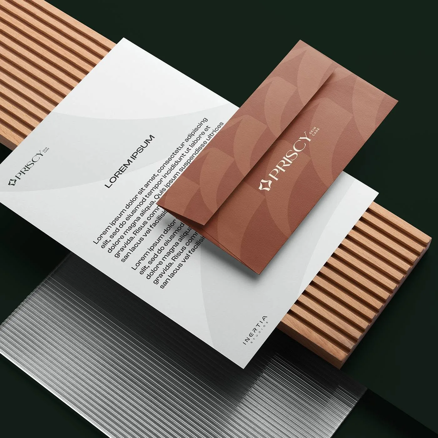
Priscy stationery system — letterhead and terracotta envelope with the petal pattern on wooden slats
The stationery system: the petal pattern in terracotta, the letterhead in silver-grey.
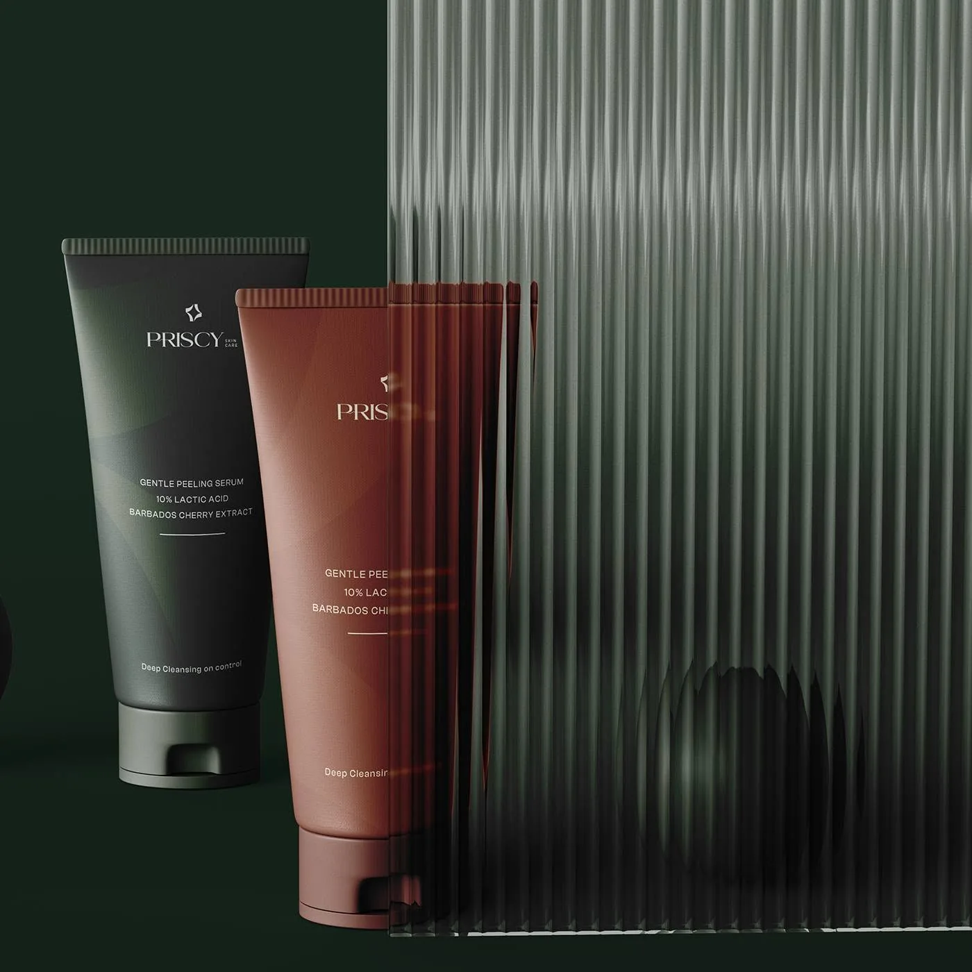
Priscy packaging — forest-green and terracotta serum tubes behind reeded glass
The packaging: one tube, two moods — forest and terracotta.
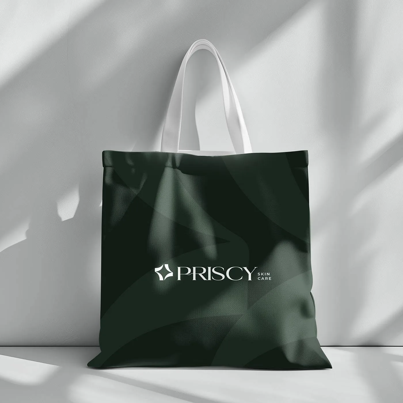
Priscy tote bag — cream lockup on a forest-green bag printed with the petal pattern
The merch layer: the pattern goes wherever the customer goes.
05 — The results
6 wks From brief to a shelf-ready identity
8 Circles behind every curve of the star mark
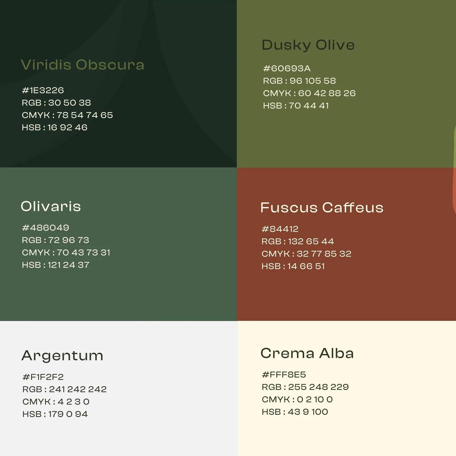
6 Palette colors — from Viridis Obscura to Crema Alba
It doesn’t look like a skincare brand. It looks like our skincare brand — that’s the difference.
Founder, Priscy Skin Care

Launching a beauty brand of your own?

Start a project
06 — Before / after
another white tube
Before — shelf sameness After — a ritual in green
07 — The system
Priscy color palette — Viridis Obscura, Dusky Olive, Olivaris, Fuscus Caffeus, Argentum and Crema Alba with their color values
The palette: six named colors, specified in HEX, RGB, CMYK and HSB.
Priscy Aa 0123 → Typography — high-contrast serif wordmark, geometric sans for support
Color — forest, olive, terracotta, cream
Star mark Circle construction, clear space, minimum sizes
Petal pattern Tone-on-tone arcs for packaging, envelopes & totes
Shelf-first Tube layouts, labels & campaign lockups
Next case study Mira Beauty A moon holding a B → one shine from shelf to screen