contact@theystudiodesign.com Casablanca · — GMT+1
Case study — 07

Mira Beauty

A beauty house that had to live on the shelf and on the screen — given a B monogram cradled in a crescent moon with a single spark, a high-contrast serif wordmark, and a forest-and-chartreuse world that carries from a 50 ml elixir bottle to an app icon.

Client
Mira Beauty
Sector
Beauty / Skincare
Year
2026
Services
Brand identity · Packaging · Digital & social
Timeline
7 weeks
01 — The challenge

Mira Beauty wasn’t launching a product — it was launching a world: serums and elixirs on the shelf, an app in the pocket, a feed full of rituals in between. Most beauty identities are designed for one of those places and merely survive in the others.

The brand needed a mark that could be embossed on a hang tag, tiled across a shopping bag, and still read as a crisp app icon at 60 pixels — one identity, one promise, everywhere: deserve to shine.

The brief, in one sentence: build a beauty brand that shines the same at 50 ml and at 60 px.

02 — The strategy

We built the identity on a single idea: the moon that holds the light. A double-stroke B nests inside a crescent moon, and a four-point spark sits where the moon opens — the customer is the light; the brand is what holds it. Around the mark, a palette of midnight forest green and chartreuse gold, closer to an evening garden than a cosmetics aisle.

The wordmark answers in kind: a high-contrast serif with a dotted lowercase i and long, drawn terminals — jewellery-like at large sizes, quiet and confident at small ones — anchored by the spaced-out mantra DESERVE TO SHINE.
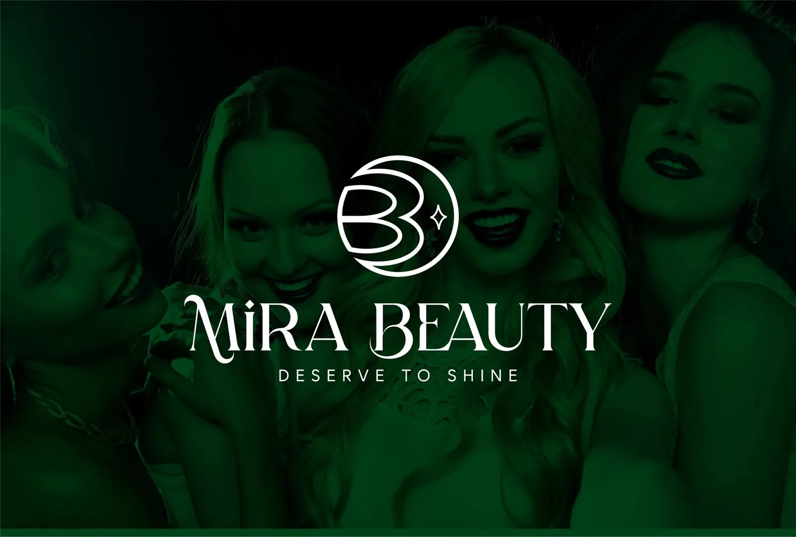
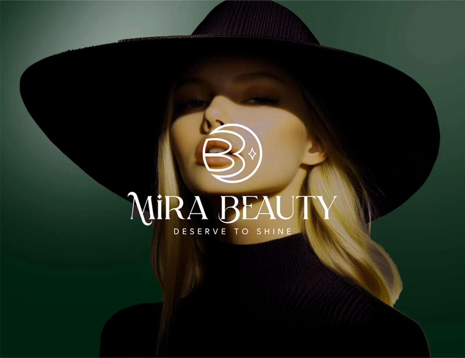
Mira Beauty primary lockup — white crescent-moon B monogram and serif wordmark over a green-tinted campaign photo
Fig. 01 — The primary lockup: the crescent-moon monogram and serif wordmark over the campaign green.
03 — The process

The monogram was engineered before it was admired. The B and the crescent share the same circle, so the mark stays balanced whether it’s drawn in one colour on a hang tag, reversed out of chartreuse on an app icon, or blown up as a watermark across a packaging panel. Every lockup — horizontal, stacked, monogram-only — was tested on dark and light grounds before a single mockup was made.
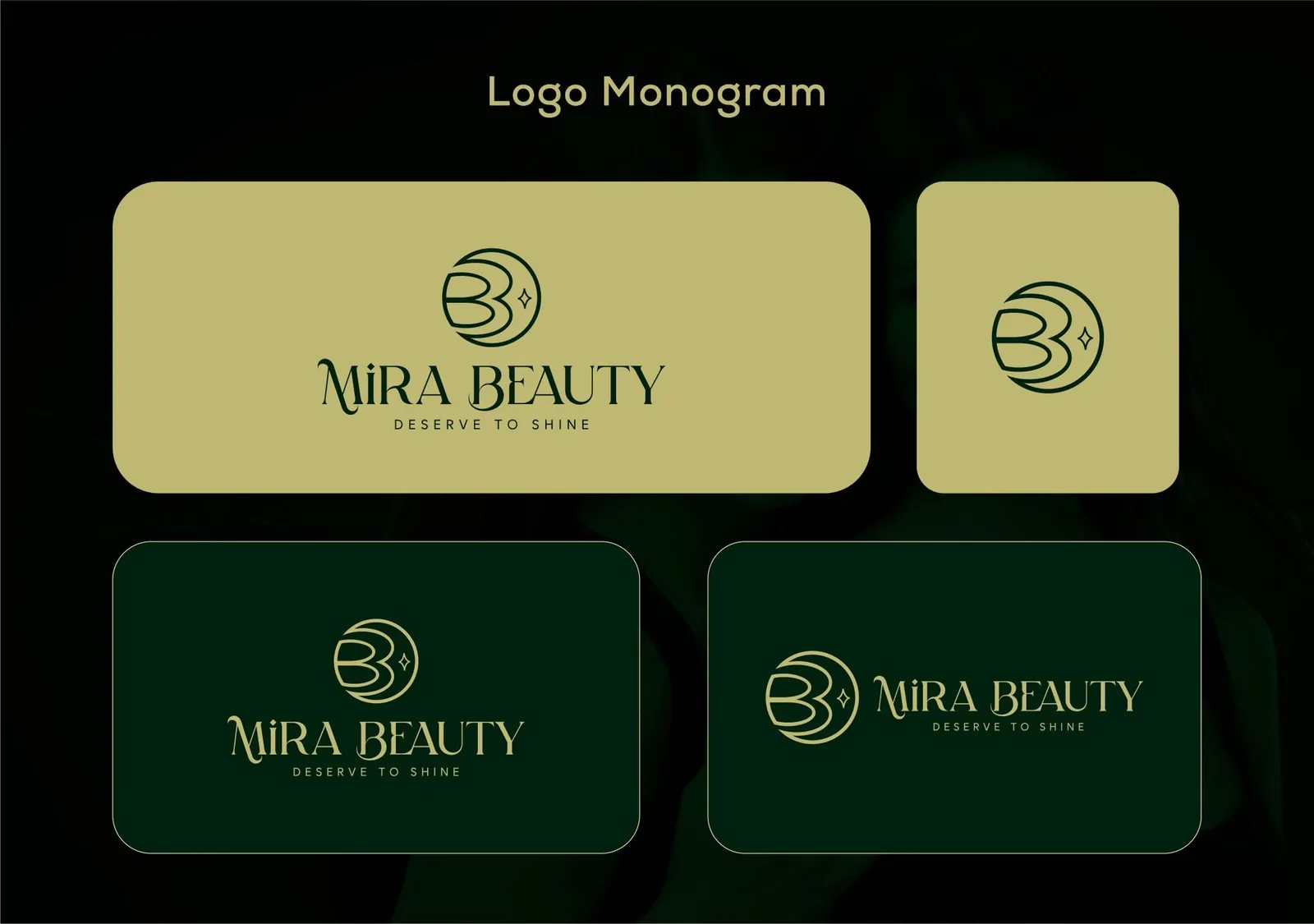
Mira Beauty logo monogram sheet — four lockup variations tested on chartreuse and forest-green grounds
Fig. 02 — The lockup system: monogram and wordmark, tested both ways on both grounds.
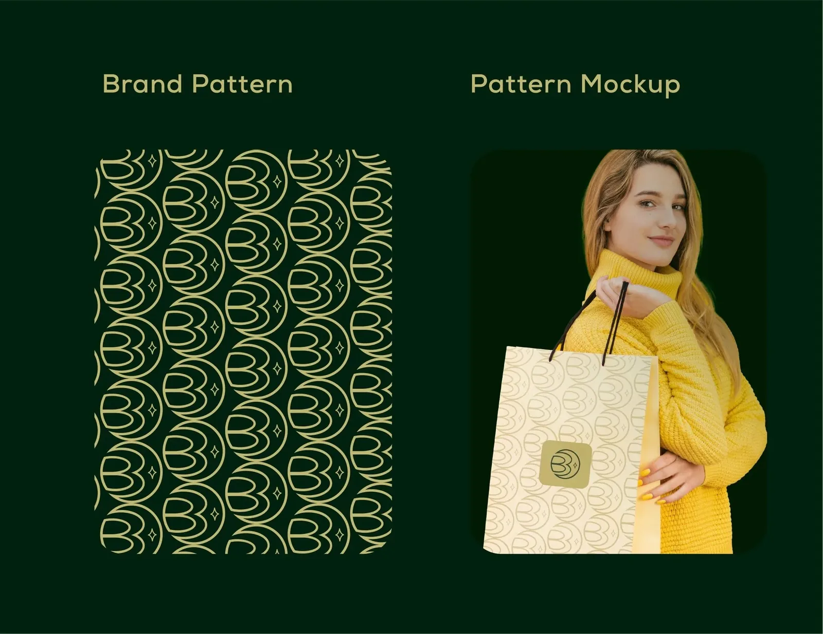
Mira Beauty brand pattern — tiled crescent-moon monogram in chartreuse on forest green, applied to a shopping bag
Fig. 03 — The brand pattern: the monogram tiled tone-on-tone, then sent out into the world on a bag.
04 — The solution
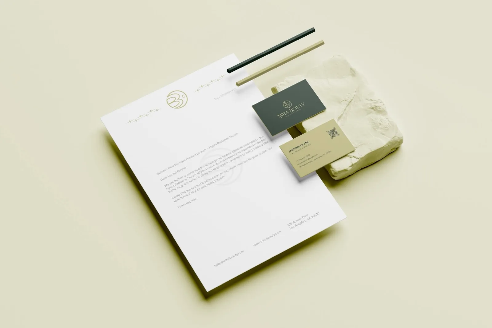
Mira Beauty stationery system — letterhead with gold monogram watermark, forest-green and chartreuse business cards on a plaster block
The stationery system: a gold watermark on the letterhead, two-tone business cards with a QR back.
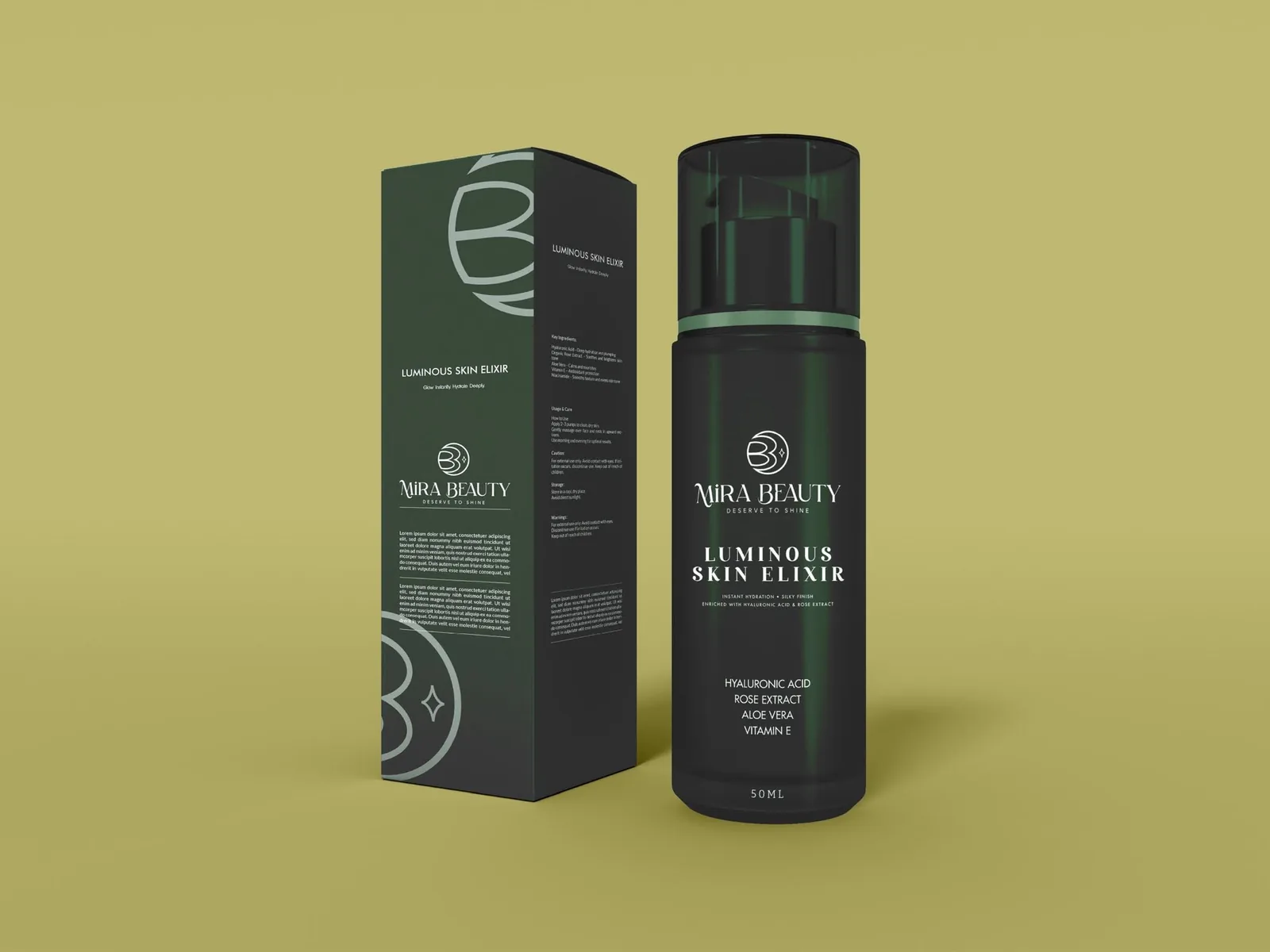
Mira Beauty Luminous Skin Elixir — dark forest-green pump bottle and box with the monogram as an oversized panel graphic
The packaging: Luminous Skin Elixir — the monogram scaled up into a panel graphic.
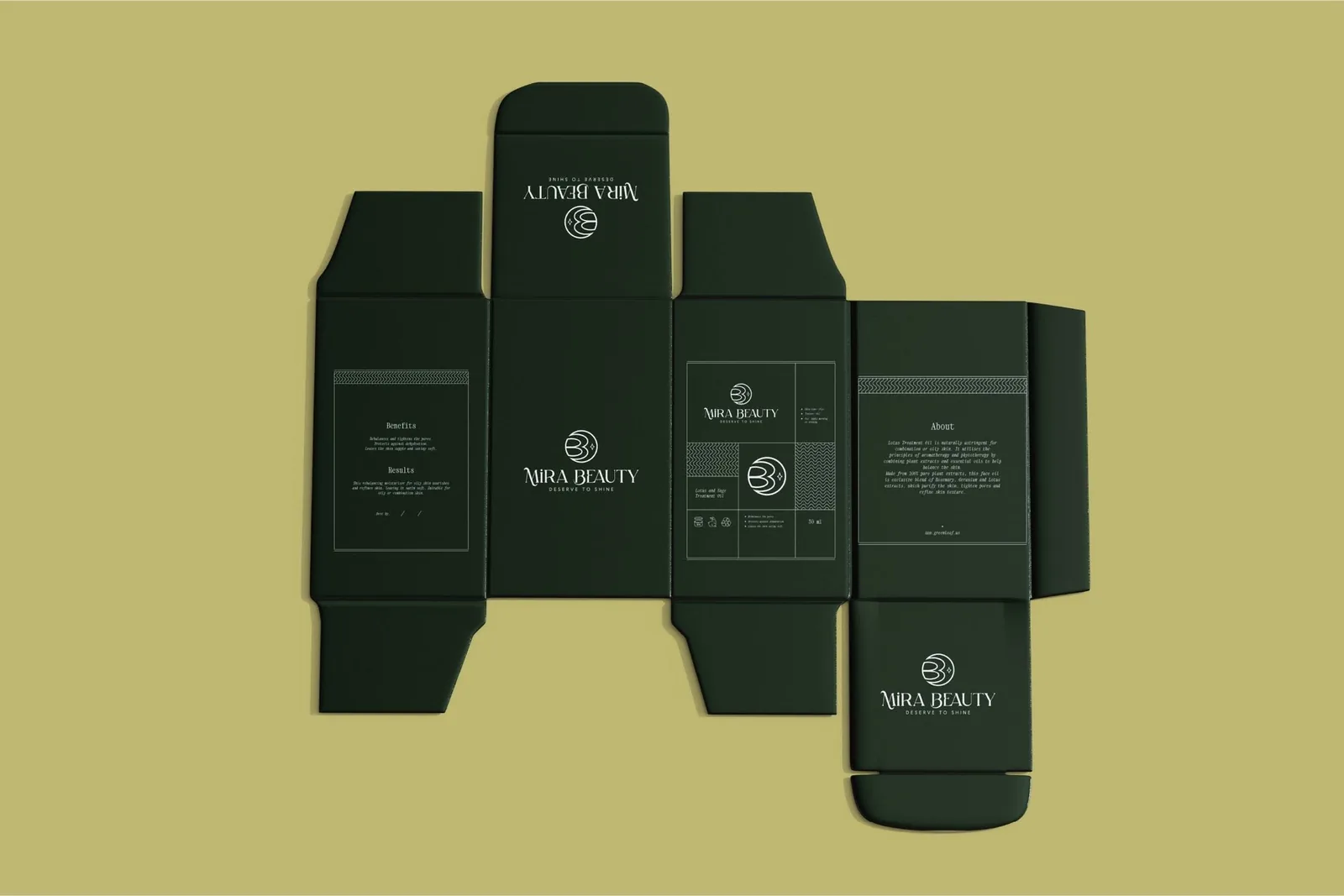
Mira Beauty box dieline — flat forest-green carton layout with benefits, about and pattern panels
The dieline: every panel written and set before the box was ever folded.

Then the identity left the shelf. The same monogram became an app icon, a sign-in screen, a set of story and feed templates — the crescent holding the interface exactly the way it holds the bottle.
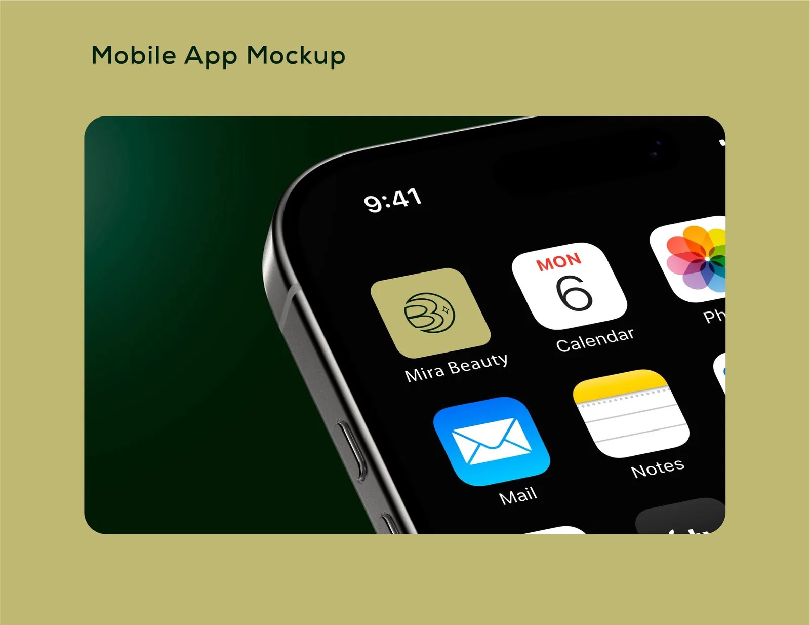
Mira Beauty app icon on an iPhone home screen — chartreuse tile with the forest-green crescent monogram
The screen layer: the monogram as a 60-pixel app icon, still unmistakably Mira.
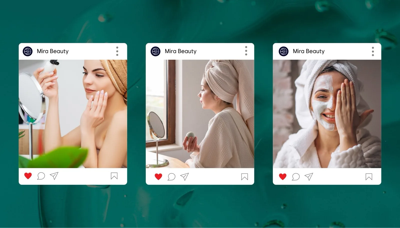
Mira Beauty Instagram feed templates — three branded posts on an emerald-green backdrop
The social layer: feed and story templates that make every ritual look like the brand.
05 — The results
7 wks From brief to a shelf-and-screen identity
16 Touchpoints designed — from dieline to app icon
1 Mark that survives every size — 60 px to storefront
People recognise the little moon before they read the name — that’s when we knew it worked.
Founder, Mira Beauty

Launching a beauty brand of your own?

Start a project
06 — Before / after
another beauty logo
Before — beauty-aisle noise After — a moon with a spark
07 — The system
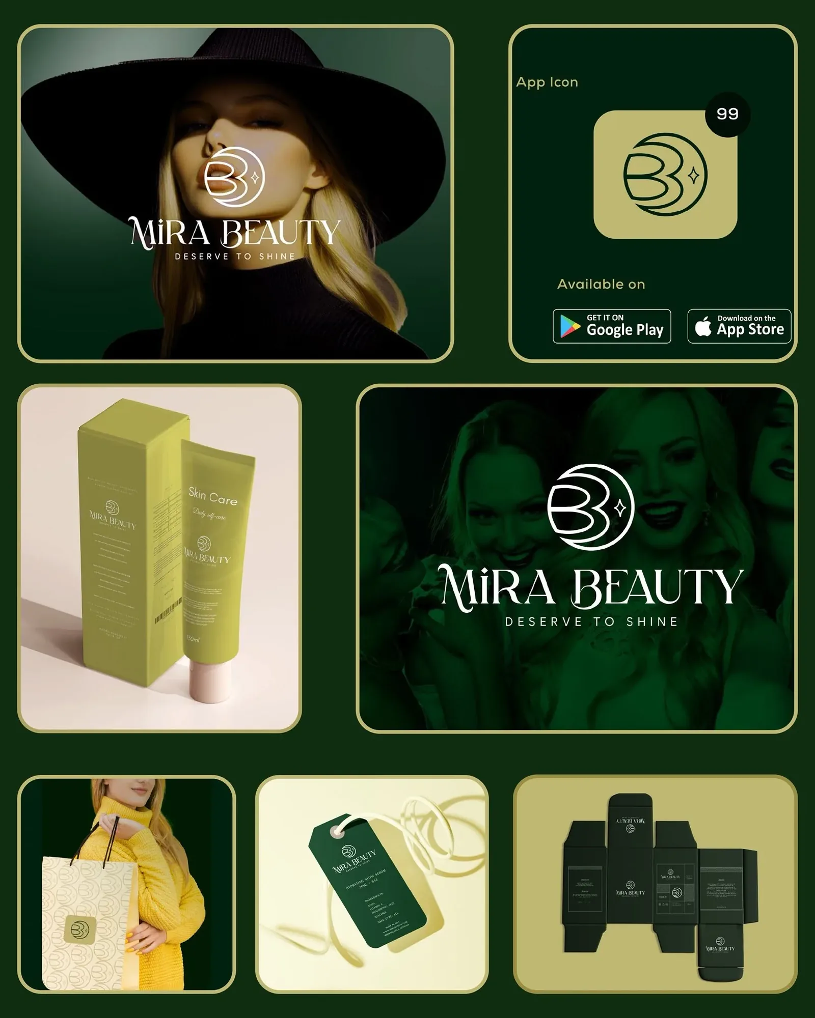
Mira Beauty brand board — campaign portrait, app icon, packaging, pattern, hang tag and dieline arranged in a chartreuse-framed grid
The system at a glance: campaign, app icon, packaging, pattern, tag and dieline — one board, one voice.
Mira Aa 0123 → Typography — high-contrast serif wordmark, geometric sans for support
Color — midnight forest, emerald, chartreuse gold, cream
Moon monogram Shared-circle construction, clear space, app-icon safe area
Crescent pattern Tone-on-tone tiling for bags, boxes & wrapping
Screen-first App icon, sign-in UI, story & feed templates
Next case study Almeida Quiami Building An a + Q drawn like a floor plan → a mark that signs the site